I'm a full-stack developer that is passionate about good user interfaces. In my newsletter, I talk mainly about UI/UX stuff. You could expect an email or two in a month, I'm not aiming to spam you with non-useful info.
Using centroids in alignment
|
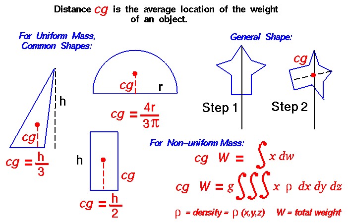
Hi Reader! Centroids...?I just wanted to sound smart and found this term 😅 Actually, we're going to talk a bit about optical balance. Take a look at these two icons. They are both aligned, but the left one looks a bit odd. The reason why it looks odd is because when we work with images, web elements, controls and everything else - we work with rectangles. On the left image I took the triangle, the circle, and hit "align vertically" and "align horizontally" in Figma. But visually it doesn't look good. Here is when the "centroid" term comes to play. Let me quote the definition from googe: The centroid of a triangle is the point at which the three medians intersect. To locate the centroid, draw each of the three medians (which connect the vertices of the triangle to the midpoints of the opposite sides). It is referred to as the "center of mass" or "balance point" of the triangle. In other words, the triangle has more "visual weight" in its left part, rather then the right part. To compensate this, we need to align triangle's centroid, rather than the rectangle. It's not that easy to demonstrate the idea, so I made another illustration What if it's not a triangle?Oh yes, if we have a complicated figure, then we can try dive into complicated math and end up visiting a therapist.
In this case I would use my eyes and see if it looks good or not. The main idea to remember: take visual weight into account, some things may look heavier than others, may be not symmetrical, and simply look slightly bigger or smaller than they are. |
Victor Ponamariov
I'm a full-stack developer that is passionate about good user interfaces. In my newsletter, I talk mainly about UI/UX stuff. You could expect an email or two in a month, I'm not aiming to spam you with non-useful info.

Live and learn. Either CSS is developing so fast, or I'm so slow, but I feel like I knew 80% of CSS in 2015, and now I know at most 50%. Today we'll talk about env function in CSS. Yeah... there are environment variables in CSS, just like in NodeJS 🤯 The env() CSS function can be used to insert the value of a user-agent defined environment variable into your CSS. The syntax is simple: env(<environment-variable>, <fallback>) But what kind of environment variables do we have and how can we use...
When I first dived into the topic of colors, it seemed to me that I was at least studying nuclear physics. It still does, though. 😅 Disclaimer: I might have some inaccuracies in this article. Sometimes I used definitions provided by Google AI, because it was challenging for me to convey/explain the ideas with precise words. But mostly there are links and definitions from Wikipedia and other resources. There are many notions and abbreviations: CIE 1931, RGB, sRGB, HSL, CMYK, Oklab, LCH, OKLCH,...
There is the grayscale filter in CSS that can make your pictures completely grayscale. It's useful when you want to show a bunch of logos, making them grayscale by default, but when you hover over them, they become colorful. But! Another trick is to use grayscale on the <html> tag. This way you can look at your app from a different perspective and see how it looks without colors. This is useful if you want to see what draws users' attention most, whether such elements as links, buttons, and...